
Contents
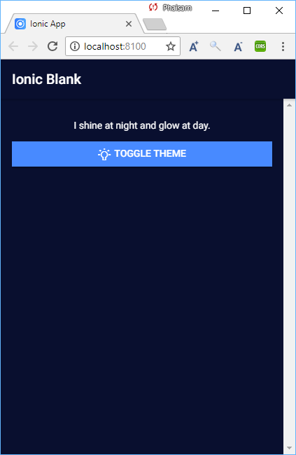
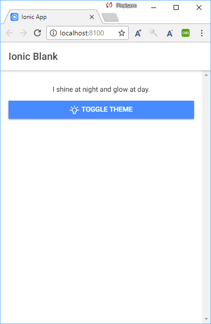
มี 2 theme สามารถกดปุ่มเพื่อสลับ theme ไปมาระหว่าง theme.dark และ theme.light
สร้างโปนเจ็กส์ใหม่ myApp และทดลองรัน
[code]
> ionic start myApp blank
> cd myApp
> ionic serve
[/code]
เพิ่ม Provider settings
[code]
> ionic g provider settings
[/code]
เพิ่มไฟล์ src/theme/theme.light.scss
|
1 2 3 4 5 6 7 8 9 |
.light-theme { ion-content { background-color: #fff; } .toolbar-background { background-color: #fff; } } |
เพิ่มไฟล์ src/theme/theme.dark.scss
|
1 2 3 4 5 6 7 8 9 10 11 12 13 14 15 |
.dark-theme { ion-content { background-color: #090f2f; color: #fff; } .toolbar-title { color: #fff; } .header .toolbar-background { border-color: #ff0fff; background-color: #090f2f; } } |
ที่ไฟล์ src/theme/variables.scss เพิ่มโค๊ดที่ด้านบนของไฟล์
|
1 2 3 |
@import "theme.light"; @import "theme.dark"; ... |
src/providers/settings/settings.ts
|
1 2 3 4 5 6 7 8 9 10 11 12 13 14 15 16 17 18 19 20 21 22 23 24 25 26 27 28 29 |
//import { HttpClient } from '@angular/common/http'; import { Injectable } from '@angular/core'; import { BehaviorSubject } from 'rxjs/Rx'; /* Generated class for the SettingsProvider provider. See https://angular.io/guide/dependency-injection for more info on providers and Angular DI. */ @Injectable() export class SettingsProvider { private theme: BehaviorSubject<String>; constructor() { this.theme = new BehaviorSubject('dark-theme'); console.log('Hello SettingsProvider Provider'); } setActiveTheme(val) { this.theme.next(val); } getActiveTheme() { return this.theme.asObservable(); } } |
บรรทั่ดที่ 1: อย่าลืม comment หรือลบออก ไม่งั้นจะ error
src/app/app.component.ts
|
1 2 3 4 5 6 7 8 9 10 11 12 13 14 15 16 17 18 19 20 21 22 23 24 25 26 27 28 |
import { Component } from '@angular/core'; import { Platform } from 'ionic-angular'; import { StatusBar } from '@ionic-native/status-bar'; import { SplashScreen } from '@ionic-native/splash-screen'; import { SettingsProvider } from './../providers/settings/settings'; import { HomePage } from '../pages/home/home'; @Component({ templateUrl: 'app.html' }) export class MyApp { rootPage:any = HomePage; selectedTheme: String; constructor(platform: Platform, statusBar: StatusBar, splashScreen: SplashScreen, private settings: SettingsProvider) { this.settings.getActiveTheme().subscribe(val => this.selectedTheme = val); platform.ready().then(() => { // Okay, so the platform is ready and our plugins are available. // Here you can do any higher level native things you might need. statusBar.styleDefault(); splashScreen.hide(); }); } } |
src/app/app.html
|
1 |
<ion-nav [root]="rootPage" [class]="selectedTheme"></ion-nav> |
เพิ่ม [class]="selectedTheme"
src/pages/home/home.html
|
1 2 3 4 5 6 7 8 9 10 11 12 13 14 |
<ion-header> <ion-navbar> <ion-title> Ionic Blank </ion-title> </ion-navbar> </ion-header> <ion-content padding> <p text-center>I shine at night and glow at day.</p> <button ion-button full icon-left (click)="toggleAppTheme()"> <ion-icon name="bulb"></ion-icon>Toggle Theme </button> </ion-content> |
src/pages/home/home.ts
|
1 2 3 4 5 6 7 8 9 10 11 12 13 14 15 16 17 18 19 20 21 22 23 24 |
import { Component } from '@angular/core'; import { NavController } from 'ionic-angular'; import { SettingsProvider } from './../../providers/settings/settings'; @Component({ selector: 'page-home', templateUrl: 'home.html' }) export class HomePage { selectedTheme: String; constructor(public navCtrl: NavController, private settings: SettingsProvider) { this.settings.getActiveTheme().subscribe(val => this.selectedTheme = val); } toggleAppTheme() { if (this.selectedTheme === 'dark-theme') { this.settings.setActiveTheme('light-theme'); } else { this.settings.setActiveTheme('dark-theme'); } } } |
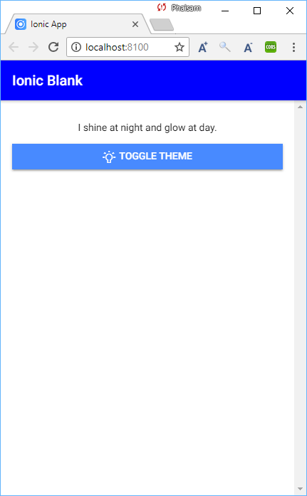
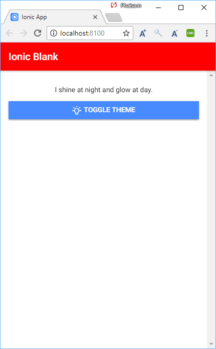
แต่ถ้าต้องการเปลี่ยนแค่สีของ ion-navbar ก็เปลี่ยนตามนี้
src/theme/theme.light.scss
|
1 2 3 4 5 6 7 8 9 10 |
.light-theme { .toolbar-title { color: #fff; } .toolbar-background { color: #fff; background-color: #f00; } } |
src/theme/theme.dark.scss
|
1 2 3 4 5 6 7 8 9 10 |
.dark-theme { .toolbar-title { color: #fff; } .toolbar-background { color: #fff; background-color: #00f; } } |
จะได้
ถ้าจะเปลี่ยนสีปุ่มด้วยจะเป็น
src/theme/theme.light.scss
|
1 2 3 4 5 6 7 8 9 10 11 12 13 14 15 16 17 18 19 20 |
.light-theme { .toolbar-title { color: #fff; } .toolbar-background { color: #fff; background-color: #f00; } .button { color: #fff; background-color: #f00; } //.tab-button { //color: #fff; //background-color: #f00; //} } |
src/theme/theme.dark.scss
|
1 2 3 4 5 6 7 8 9 10 11 12 13 14 15 |
.dark-theme { .toolbar-title { color: #fff; } .toolbar-background { color: #fff; background-color: #00f; } .button { color: #fff; background-color: #00f; } } |
Link